Seiler Instrument
In a rapidly changing marketplace, it’s imperative for a company’s branding to adapt. In the summer of 2022, Seiler engaged UPBrand to help this respected, multi-generational organization prepare for future success.
UPBrand’s research revealed three initial objectives:
- Refresh the overarching Seiler brand architecture and visual identity
- Re-establish Seiler as the master brand while creating harmony – and a visual system – for the various divisions
- Reposition and grow the Seiler manufacturing department – starting with a new website
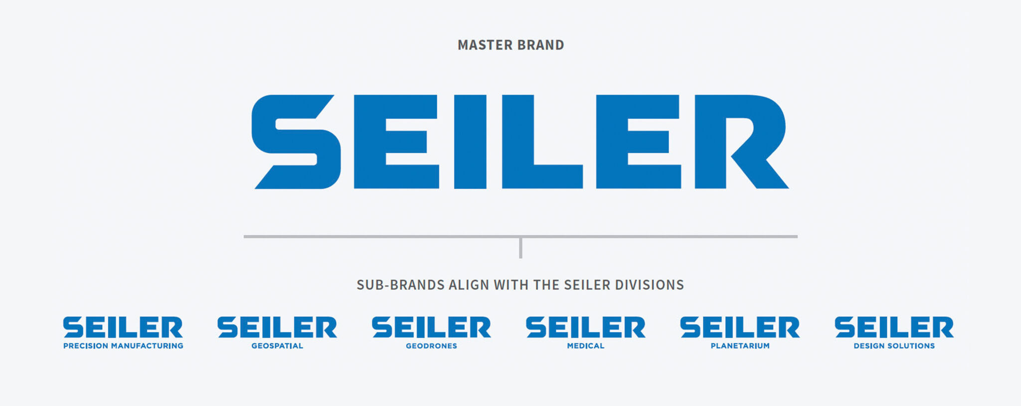
Brand Architecture
Our research indicated a master brand approach offered the greatest benefits, unifying the divisions under Seiler and establishing the sum is greater than its parts. Leaning into the positive reputation and heritage of Seiler, this enabled the opportunity to build reputation and perception outside of military optical sighting systems and provided more opportunity for growth. The goal was to find new sources of revenue outside their traditional channels.
Logos and Icons
We created a custom typeface for Seiler with a cut in the “S” to add dynamic motion. This created a triangle in the negative space which is a nod to some of the legacy tools used to create and adjust precision equipment. All subsequent letters were reshaped for balance and cohesion. Then, locked to the master logo, division logos were established, creating consistency and continuity and enabling flexibility as markets and capabilities evolve.
All six divisions now have a unified identity and corresponding icon – a circular element symbolizing the legacy of Seiler – a trusted, family-owned company respected worldwide for its expertise in precision optics. The central element of each relates to the individual Seiler division and its associated industry.
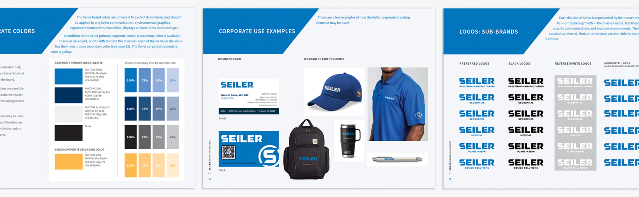
Brand Guidelines
The Seiler name and brand stand for world-class quality. The brand’s consistency and attention to detail hold Seiler to the highest standards. We developed brand guidelines that included a brand promise, attributes, identity elements and a tagline that work together to tell a consistent story in the marketplace. The sum of the parts make up the brand guidelines, which serve as quality control to ensure that all of Seiler’s messaging — both internal and external — rings true to the brand’s essence.
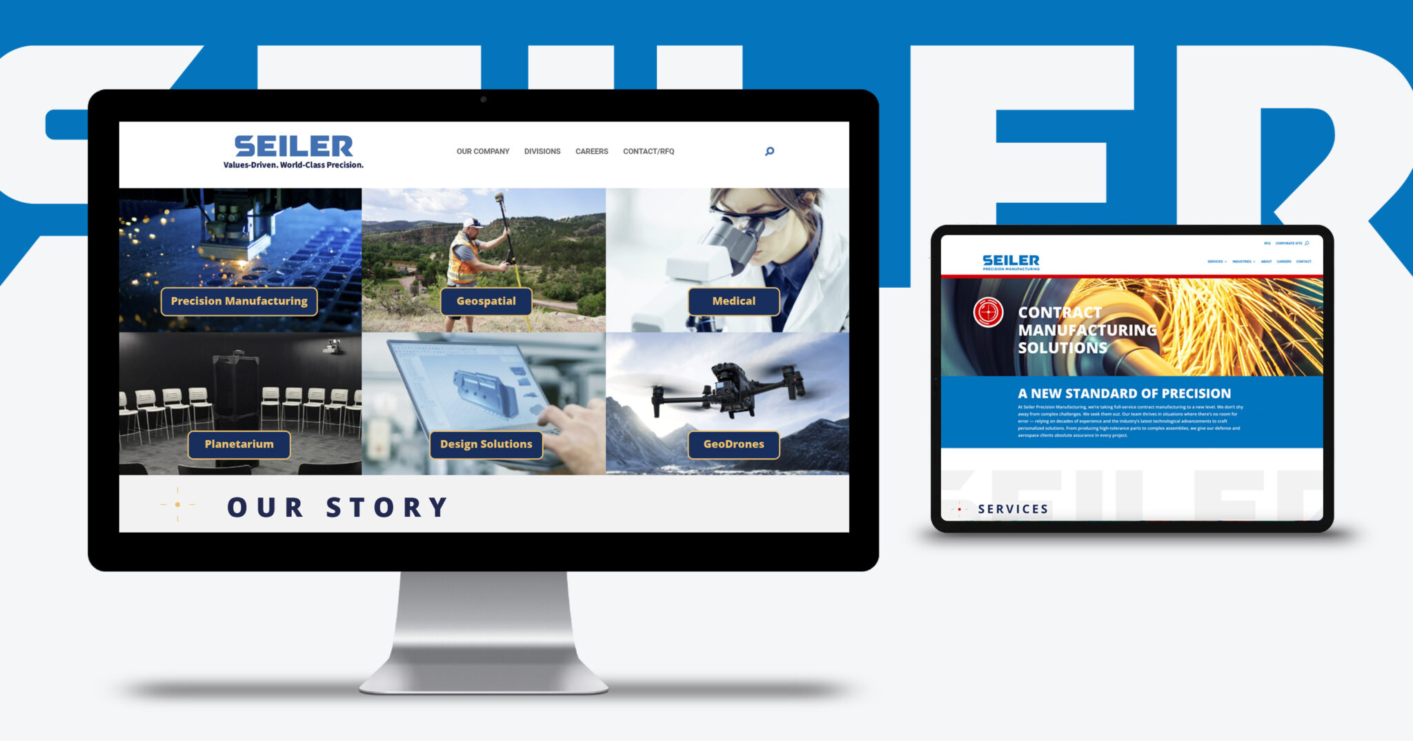
Websites
With the new brand identity established, it was time to bring it to life. The existing website had become all things to all audiences, preventing a simple and positive user experience and hindering sales leads. After a thorough site audit, we recommended a Corporate site and individual Division sites with connections back to one another which led to a more focused journey for the average site visitor. We also overhauled the Corporate site’s content with an eye for brevity and SEO best practices, so users could easily skim and find the information or division they were looking for. These recommendations serve the overarching need to present a more clear and contemporary master brand while serving the user needs of each division.
Early metrics indicate significant improvement in site performance and use experience.