Jewish Family Services
JFS approached us about the possibility of rebranding their organization and, after a market analysis, we recommended a new, sleeker name. Previously Jewish Family & Children’s Services, they wanted something that reflected their legacy of community service without feeling old and stuffy. And they also wanted the new branding to speak to their inclusivity and progressive nature.
As for audience, branding needed to appeal to older, primarily Jewish donors, as well as clients who were mostly not Jewish and living below the poverty line. Thus was our challenge: marrying donors’ desire for a sophisticated look-and-feel with clients’ need for approachability.

Case studies only show what goes out in the world. We wanted to give you a glimpse of what goes into our creative decisions. For this installment, we’re giving you a peek at all the stuff left on the cutting room floor from our work branding Jewish Family Services (JFS). The other color palettes we perfected. The other fonts we painstakingly selected. The other logos we built from scratch, loved, lived and presented. So take a look at the other options – the ones our client said made choosing so hard it was painful.
But in a hurts-so-good kinda way.
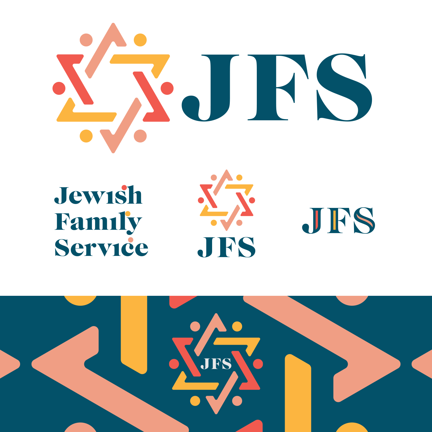
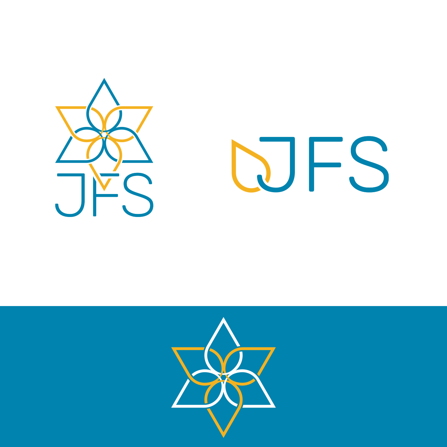
Our first option used an interconnected Star of David to represent inclusivity, a chunky 70s-esque serif for a touch of nostalgia and a half-muted, half-bright color palette to signify communities coming together to build a better future for St. Louis families.
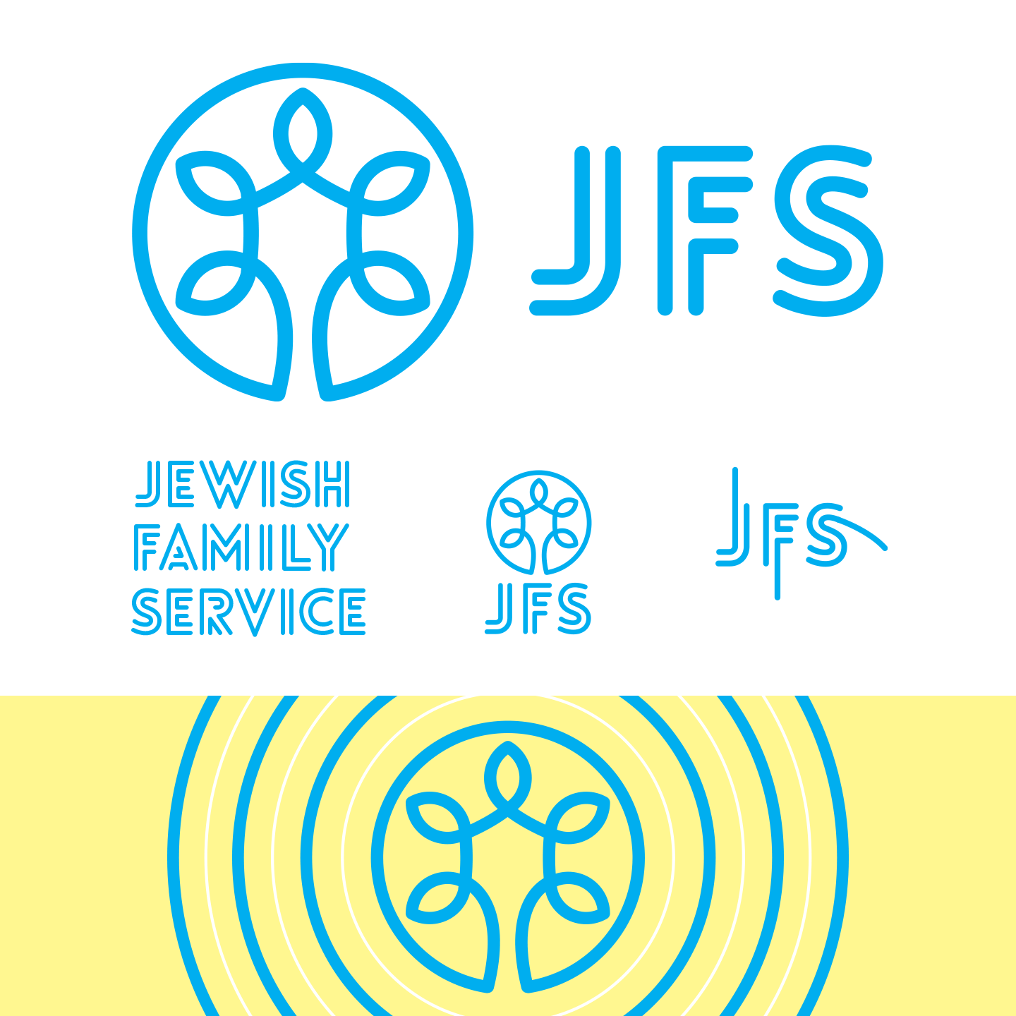
Crisp. Clean. Light. Our second option leaned into Judaic color schemes – classic blue and an illuminating yellow – and paired it with a logo that emulated both the Star of David and the Tree of Life. Inclusive photography pulled in the community JFS serves. And the Lovelo Line Bold font added a touch of modernity to the whole identity.
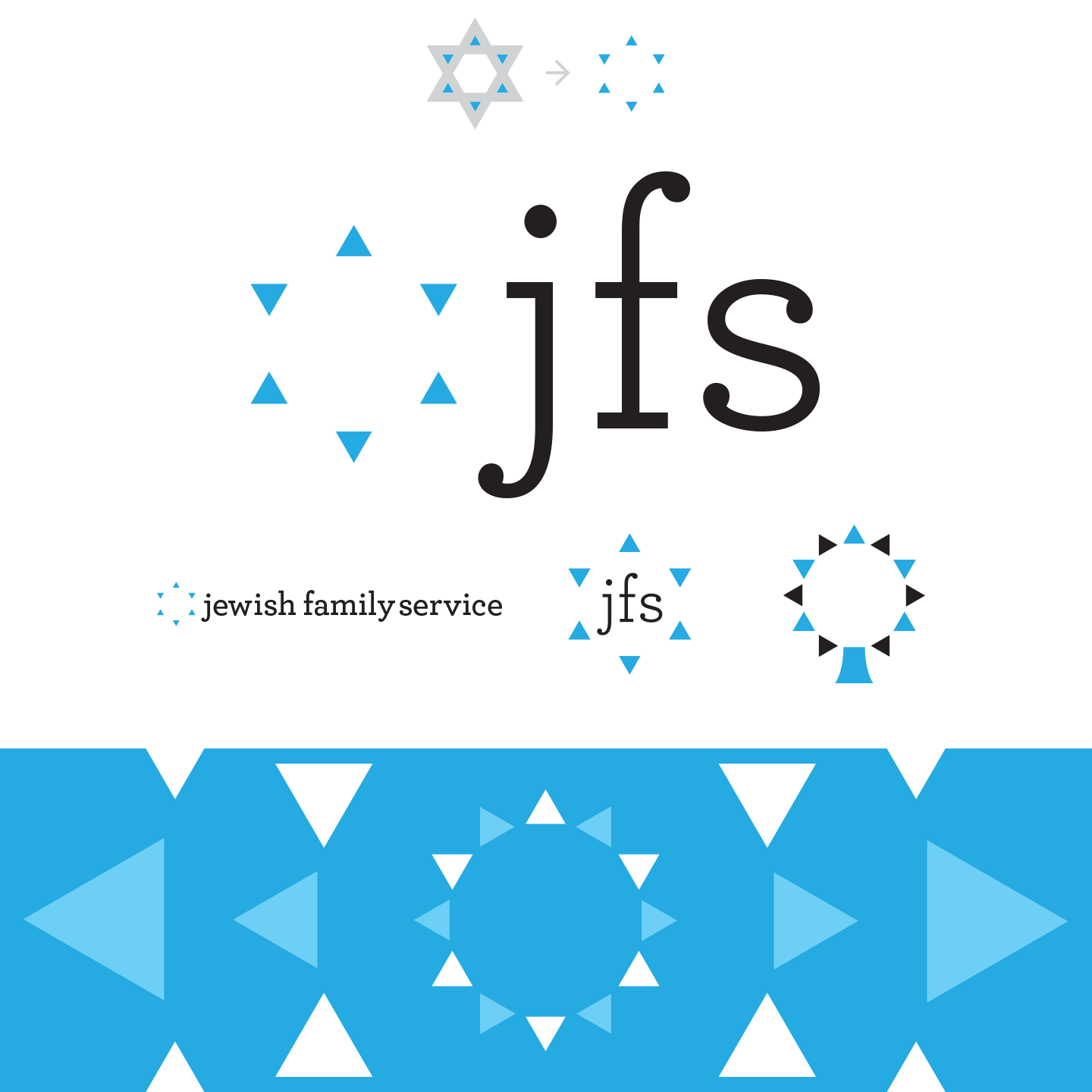
For our third option, we began to think about the space that JFS fills – the need it serves in our community. So we took the Star of David and filled in the negative space to create a sleek, simple triangle design element that could be used across brand collateral. Paired with black and white photography and an elegant serif, this identity is as timeless as it is thoughtfully made.
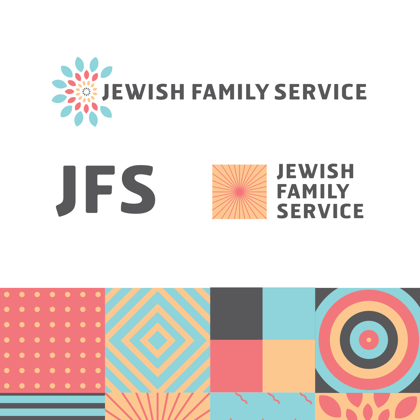
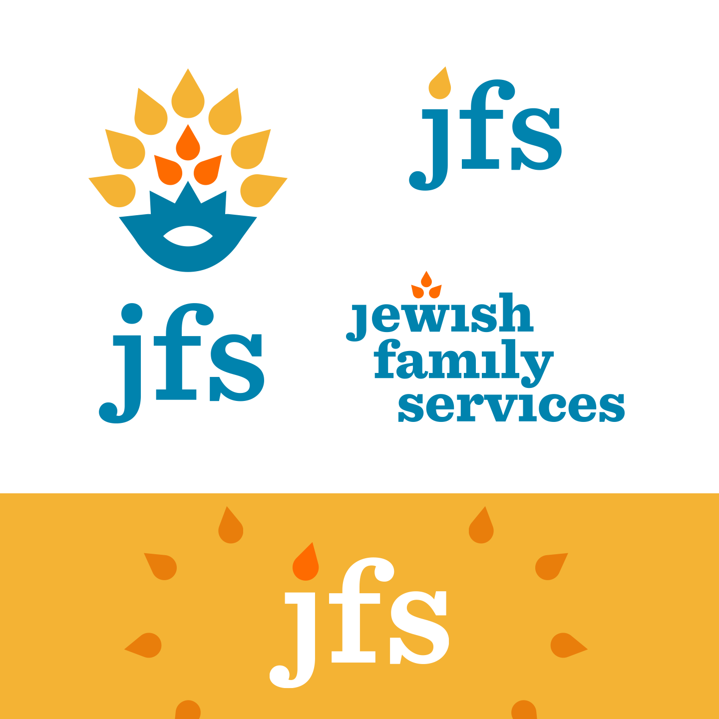
Our fourth option took a different approach. The sunny palette was chosen to create a sense of warmth and invitation. Fun patterns appealed to young families and donors alike. The starburst elements pulled back on the Jewish symbology, but still hinted at the brightness and illumination of Shabbat and Chanukah candles.
Option five took those candle flickers and built a Star of David from them. With a thick, legible Rubik Medium font and a kid-friendly color scheme, this option played up the Family part of Jewish Family Services.
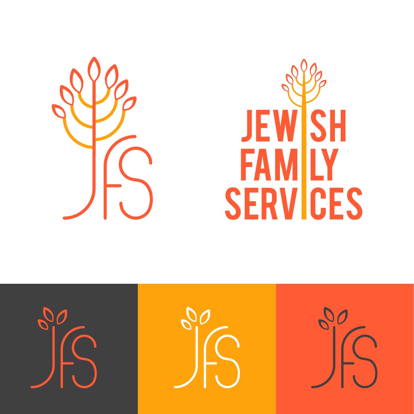
The sixth option was inspired by mid-century design that is common in Jewish-American spaces. We felt the autumnal palette and menorah imagery beautifully played up the warmth and care JFS promises. And by elongating the menorah through the brand name to create a Tree of Life, we created a sense of deep connection and long-lasting community service.
The seventh and final option explored use of the Hamsa, a hand-shaped amulet often worn by Jewish women or placed in the home for protection. Because Jewish Family Services seeks to protect, shelter and provide for the community, the Hamsa was a perfect symbol to use for this treatment. Coupled with bright photography and a bold palette, this final option gave our client a completely different option to consider.