


Learning Starts With Curious Minds
- Challenge
- Parents as Teachers was changing lives globally and struggling to explain what it did to anyone outside the room.
- Solution
- We untangled the architecture, modernized the identity, and gave a sprawling international organization one clear thing to say.
- Results
- 60% global affiliate adoption in year one and a launch campaign that beat its own projections.
Parents as Teachers
Challenge
Parents as Teachers is an international nonprofit with a remarkable footprint, based in evidence-based curricula, a global affiliate network, and decades of measurable impact on early childhood development. The brand had lost control of its story over time.
Messaging was fragmented and the visual identity hadn’t kept pace. The legacy logo depicted a narrow, traditional family that didn’t reflect the diverse caregivers the organization actually served. And internally in the organization, national centers, state offices, local affiliates and partner organizations were all interacting with the brand differently, with no single source of strategic truth to anchor them.
The website made it worse. It had become an overgrown archive where finding a local affiliate felt like a small ordeal. Parents as Teachers needed a full transformation: architecture, identity, messaging and digital experience, all at once, across a global network.
Solution
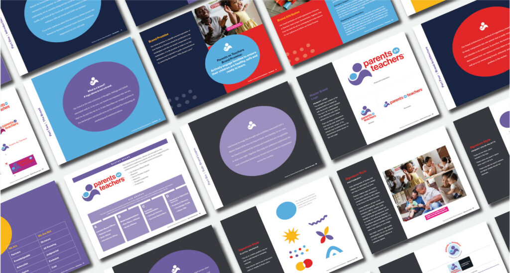
We started with discovery (as always), performing global surveys, stakeholder interviews across multiple time zones, and focus groups to understand what made the organization work before deciding how to make it clearer. We engineered a master brand architecture that established Parents as Teachers as the overarching endorser for four distinct sub-brand categories. This created one clear flag with multiple expressions.
A unified messaging platform was built around a single brand promise: Actively engage families to ensure their children are healthy, safe and ready to learn. International affiliates finally had a shared verbal system instead of dozens of improvised variations.
The visual identity got a complete overhaul. The outdated logo was replaced with an abstract, warm mark depicting a caregiver and child in a supportive embrace, paired with a vibrant palette that captured growth, education and the spirit of early childhood without being precious or juvenile about it.
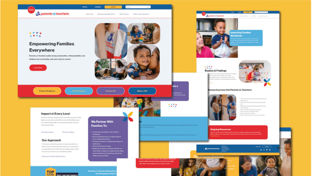
The website was rebuilt from the architecture out: clearer user paths for visitors, educators and donors, an optimized affiliate portal, rewritten copy streamlined for brevity and SEO, and visuals that finally reflected the updated brand.
The launch campaign ran across multiple channels and was anchored by the organization’s first-ever national 30-second TV spot. Cinematic, intimate, and built around the journey of parenting rather than the mechanics of a nonprofit.
The brand was unveiled at the Parents as Teachers International Conference in Denver, with hands-on workshops for regional and national leaders to ensure adoption. The new branded merchandise sold out within hours.
Results
-
60% Global Affiliate Adoption in Year One
For an expansive network operating under diverse funding structures across multiple countries, that’s a signal that the work resonated where it needed to most.
-
11.8M Impressions
The 90-day global launch campaign exceeded initial performance projections by 26%, driven by our national TV spot.
-
National Earned Media
The rebrand generated significant editorial coverage and drove thousands of new visitors to the redesigned digital experience.
-
From Complex to Compelling
Parents as Teachers went from an organization that was hard to explain to one that was hard to forget: a global force for early childhood development with an identity finally worthy of its impact.